In today’s fast-paced digital world, a responsive website is no longer a luxury—it’s a necessity. As we step into 2025, businesses and developers must adapt to new technologies, changing user behaviors, and evolving design trends. Responsive website design ensures that your website delivers a seamless experience across all devices, from smartphones and tablets to laptops and large desktop screens. This ultimate guide will help you understand why responsive design matters in 2025 and how to implement it effectively.
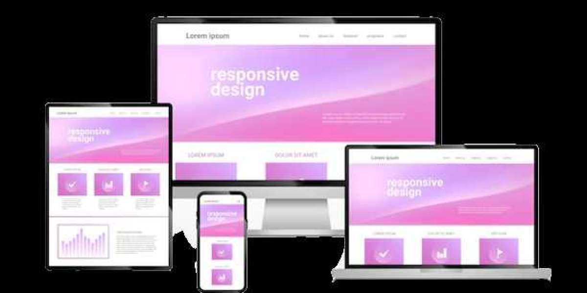
What Is Responsive Website Design?
Responsive website design is an approach that allows a website to automatically adjust its layout, images, and functionalities to fit different screen sizes and devices. Whether a visitor uses a smartphone in portrait mode or a 4K desktop monitor, the site adapts to provide an optimal user experience. Instead of creating separate versions of a website for mobile and desktop, developers use fluid grids, flexible images, and CSS media queries to make one website fit all.
Why Responsive Design Is Crucial in 2025
1. Mobile-First Era: Over 60% of global web traffic now comes from mobile devices. In 2025, this number will continue to grow as 5G networks expand and smartphone usage rises. A responsive site ensures that your business doesn’t lose potential customers who prefer browsing on the go.
2. Improved SEO: Google prioritizes mobile-friendly websites in its search rankings. With algorithms getting smarter each year, responsive design is essential for maintaining visibility in search results and driving organic traffic.
3. Cost and Time Efficiency: Maintaining a single responsive website is more affordable and less time-consuming than managing separate desktop and mobile versions. Updates, security patches, and design changes are implemented once, saving valuable resources.
4. Consistent User Experience: Visitors expect smooth navigation and fast load times regardless of the device they use. Responsive design ensures a consistent brand experience, which improves user satisfaction and boosts conversions.
Key Elements of Responsive Website Design in 2025
To stay ahead in 2025, developers and designers should focus on:
Fluid Grids and Flexible Layouts: Use percentage-based grids that automatically resize based on the user’s screen.
Advanced CSS and Media Queries: Leverage modern CSS features like container queries and clamp() functions for precise control over design responsiveness.
Optimized Images and Videos: Implement responsive images (using
srcset) and scalable vector graphics (SVGs) for sharper visuals without slowing down the site.Mobile-First Design Strategy: Start designing for small screens first, then expand to larger ones. This ensures performance and usability on all devices.
Accessibility: Prioritize inclusive design by ensuring proper contrast, alt text for images, and keyboard-friendly navigation.
Future Trends to Watch
As technology advances, new trends will influence responsive design. AI-driven personalization, voice-based navigation, and immersive experiences using AR/VR will become more common. Progressive Web Apps (PWAs) and faster frameworks like Next.js will further enhance performance and responsiveness.
Conclusion
Responsive website design in 2025 is about more than just fitting different screen sizes—it’s about creating flexible, future-ready websites that meet the needs of an ever-changing audience. By adopting the latest techniques and focusing on user experience, businesses can stay competitive, boost SEO rankings, and provide exceptional digital experiences. Whether you’re building a new site or updating an existing one, investing in responsive design is the smartest step you can take for long-term success.